
Back
Responsive Email Templates
You can use the EzyCourse email builder to create beautiful templates. Also, our email builder lets you design complete responsive email templates. In this article, you’ll learn how to make your templates responsive across all devices.
The builder provides responsiveness automatically for most of the contents like images, for example. You can preview the template and view how it would look on different devices.
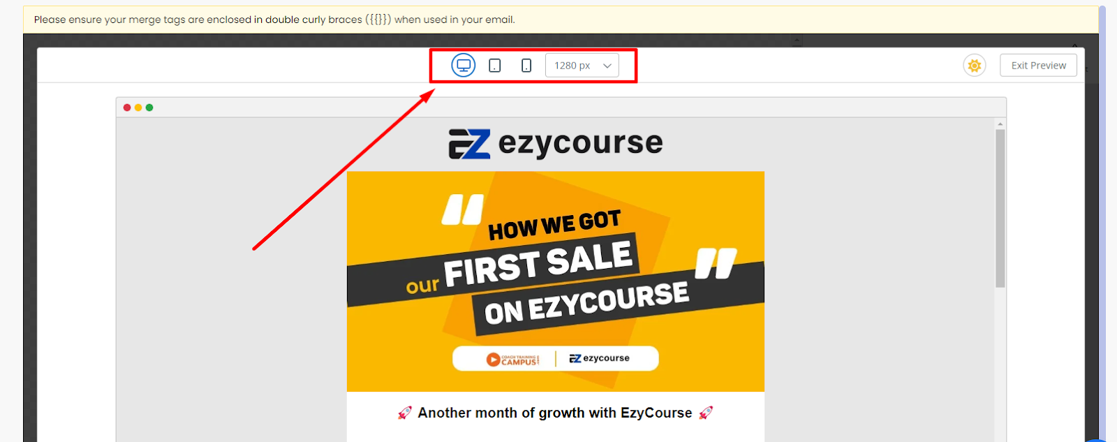
Apart from that, you can view templates in mobile view and see which section requires a little modification. You can change the view from the bottom left corner, as you are designing.
Designing Template on Mobile View
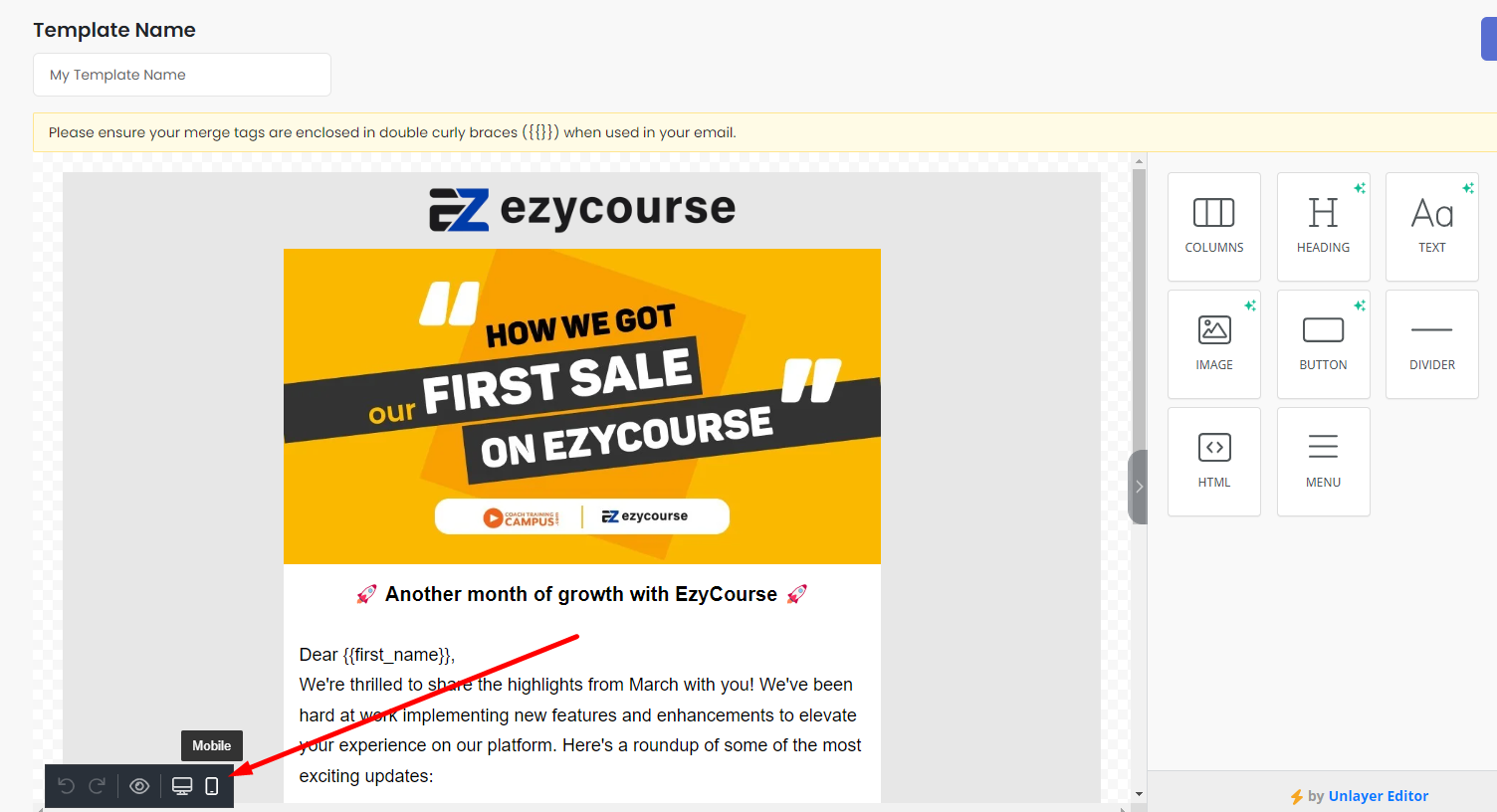
After designing a template, turn on the mobile view from the bottom left corner. Then you can see which sections are off target for mobile devices and adjust accordingly.
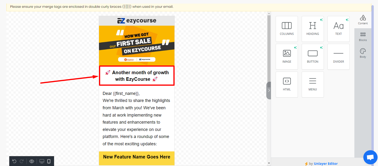
Here, the Heading content doesn’t quite look like how we want it. We could decrease the font-size to let it take up a single line only.
[Note: When you are on mobile-view, every setting you change will only apply to mobile devices. It will not affect the other device view.]
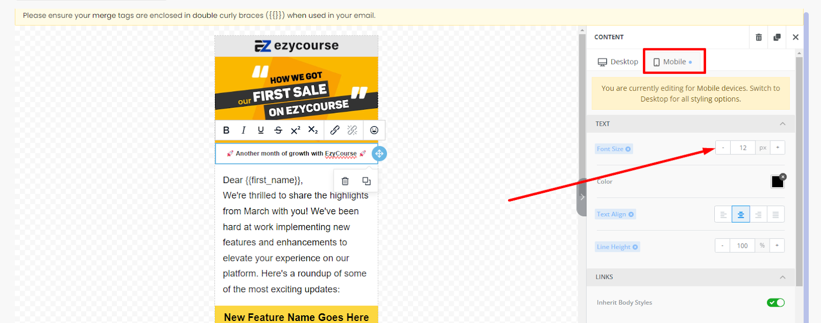
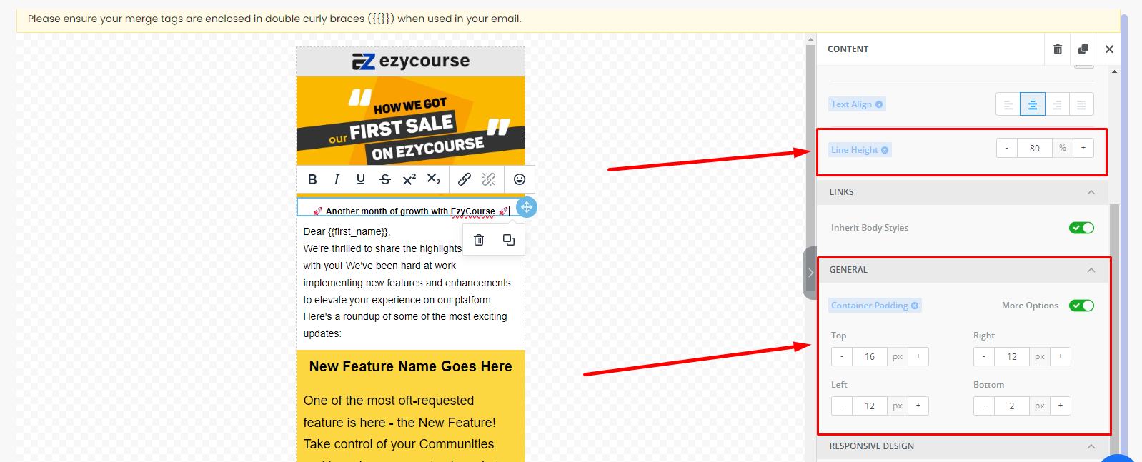
You can also adjust the extra gap in-between texts which you might see on mobile view from General, by turning on the “More Options” setting. Adjusting the line-height will also help to adjust the gaps.
If you are changing the font-size of one Heading or Text content, ensure you are doing the same for the whole template texts so that cohesion is maintained.
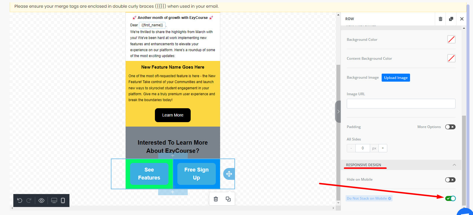
Stacked Contents
When you put contents side by side, then you might see them stacked on the mobile view. But, our email builder provides a simple solution to this problem.
Here, these two buttons are placed side by side using two columns.
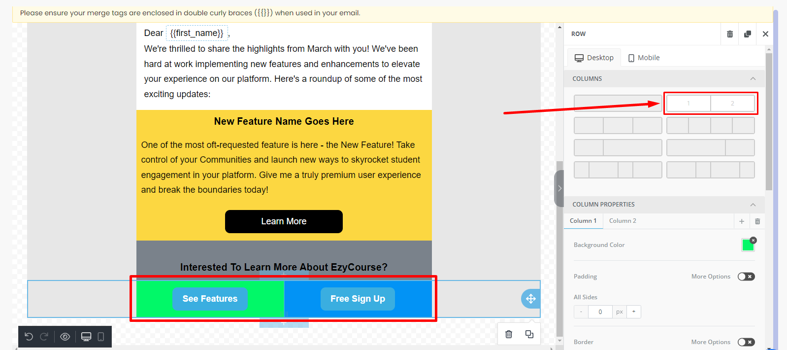
But, they become stacked when viewed on the mobile view.
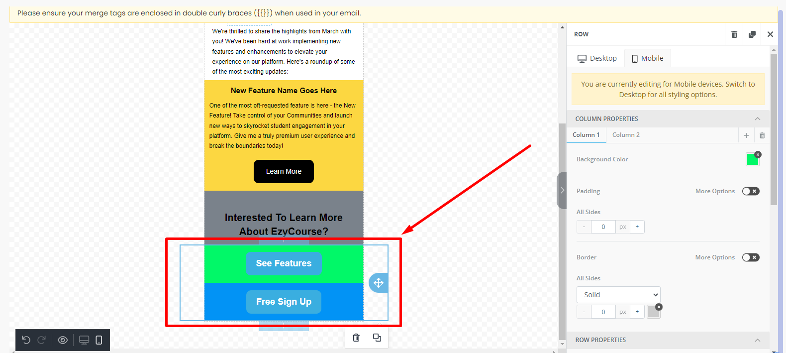
To still have them side by side across all devices, select the section first and then turn on the “Do Not Stack on Mobile” option under Responsive Design.
Now, you can decrease the font-size, adjust width, etc. just like with texts to make the buttons suitable for mobile view. In this way, you could craft responsive email templates easily on EzyCourse.