
Back
How To Create Device Specific Responsive Pages
Our builder 2.0 lets you create responsive pages that are ideal for different devices. In this article, you’ll learn how to make your page responsive using the builder 2.0.
Group Everything
The first rule of ensuring your content stays responsive across all devices is grouping content together using the box element. If you use elements individually without grouping then their position will distort in other devices, or alignment will not be maintained.
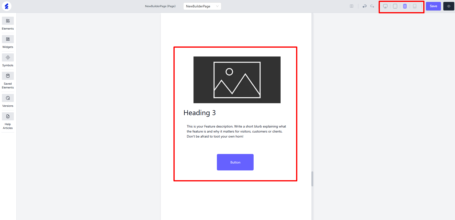
Take the following design for an example. Here, we’ve used an image, a header, a paragraph text, and a button. All used individually with Elements. But, no Box Element is used for grouping them.

Now, change the device from the topbar to see how it looks on other devices. Notice how the alignment is not maintained and the original design or layout is changed across the devices.

Now, let’s group these same elements within a Box element. First take a box element and then drop the other elements one by one.
[Note: When dropping elements inside a box element, always ensure that the elements are grouped or nested with the box. You can check that by moving the box. If everything moves with the box then that means it is grouped properly. Ensure elements are resized properly before putting inside the box.]

Now, everything will remain together and the layout will be maintained across the devices. But, you will have to resize and also position the box to make sure it’s ideal for the different devices. Same goes for the content/elements inside the box. To do that, simply view a specific device and make your changes.

Furthermore, it’s not just height and width, you have to adjust the horizontal alignment of the box also. But, the content inside the box retains their alignment. Also, notice that the row count of the section is automatically adjusted across the devices. You can still change and set your own row count.

For boxes placed side by side, the builder will automatically adjust according to the space available in different devices. For example, the three boxes placed side by side on the desktop view are aligned in the following way in the tablet view. And it happens automatically without you having to do anything.


Once you have the elements inside the box, you can move the box and everything will move altogether. But, it is important to note that resizing the box will not resize the elements inside. You have to first resize the elements inside, and then resize the box accordingly.